Silus font
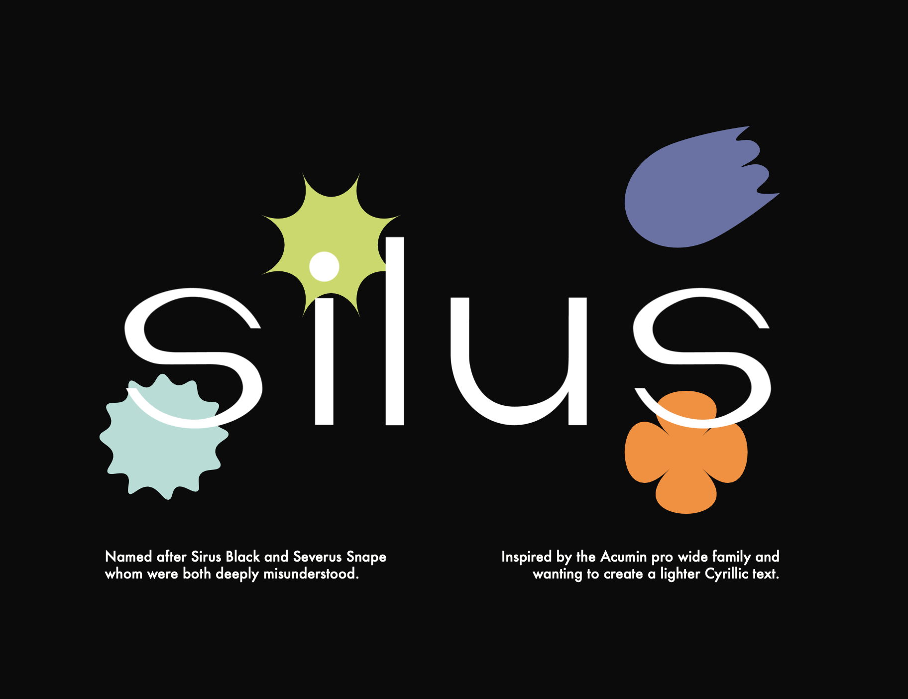
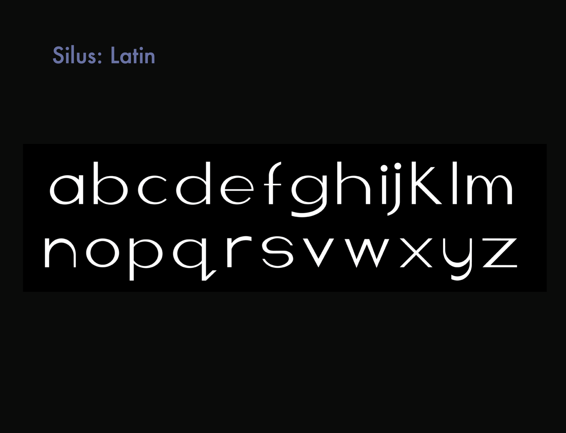
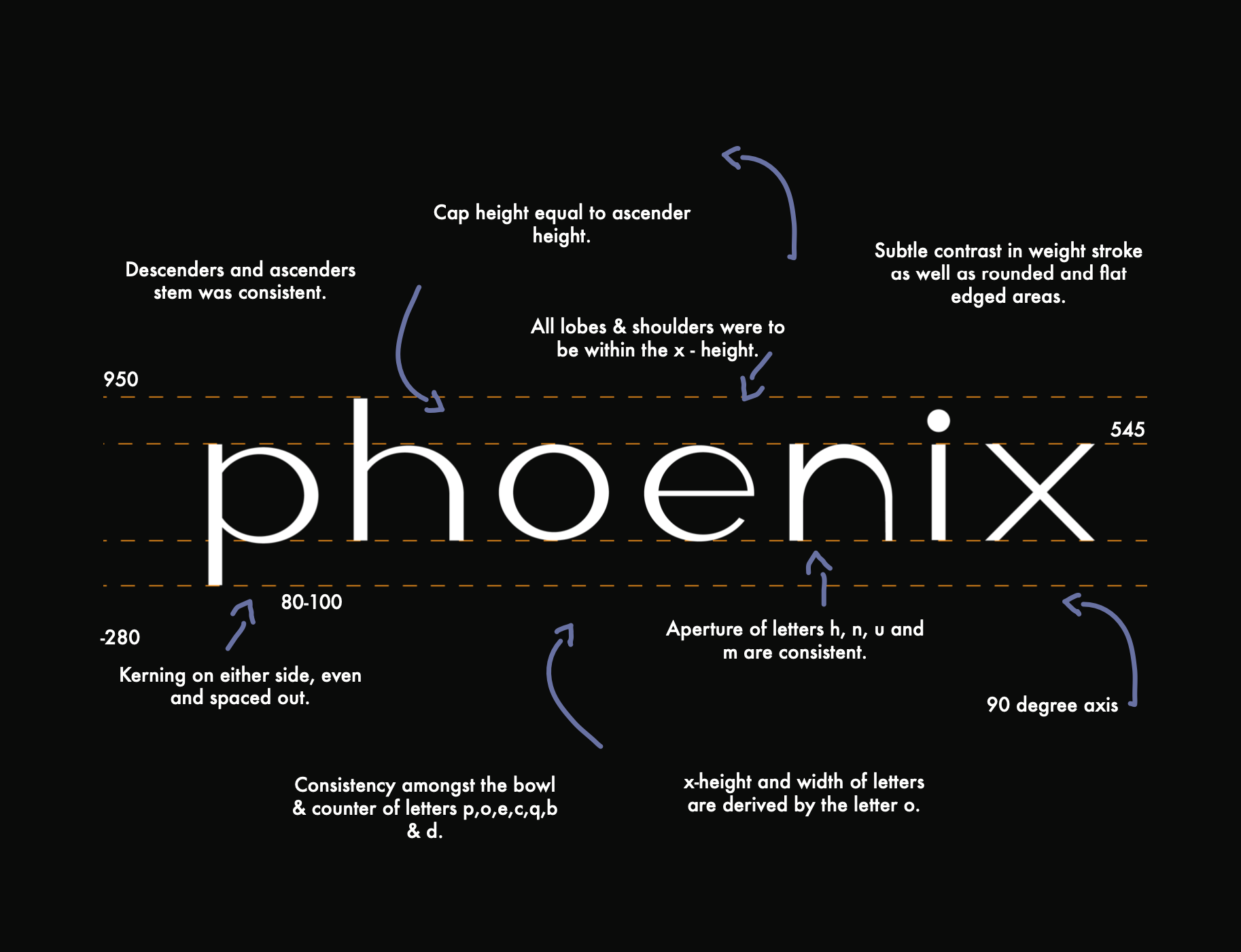
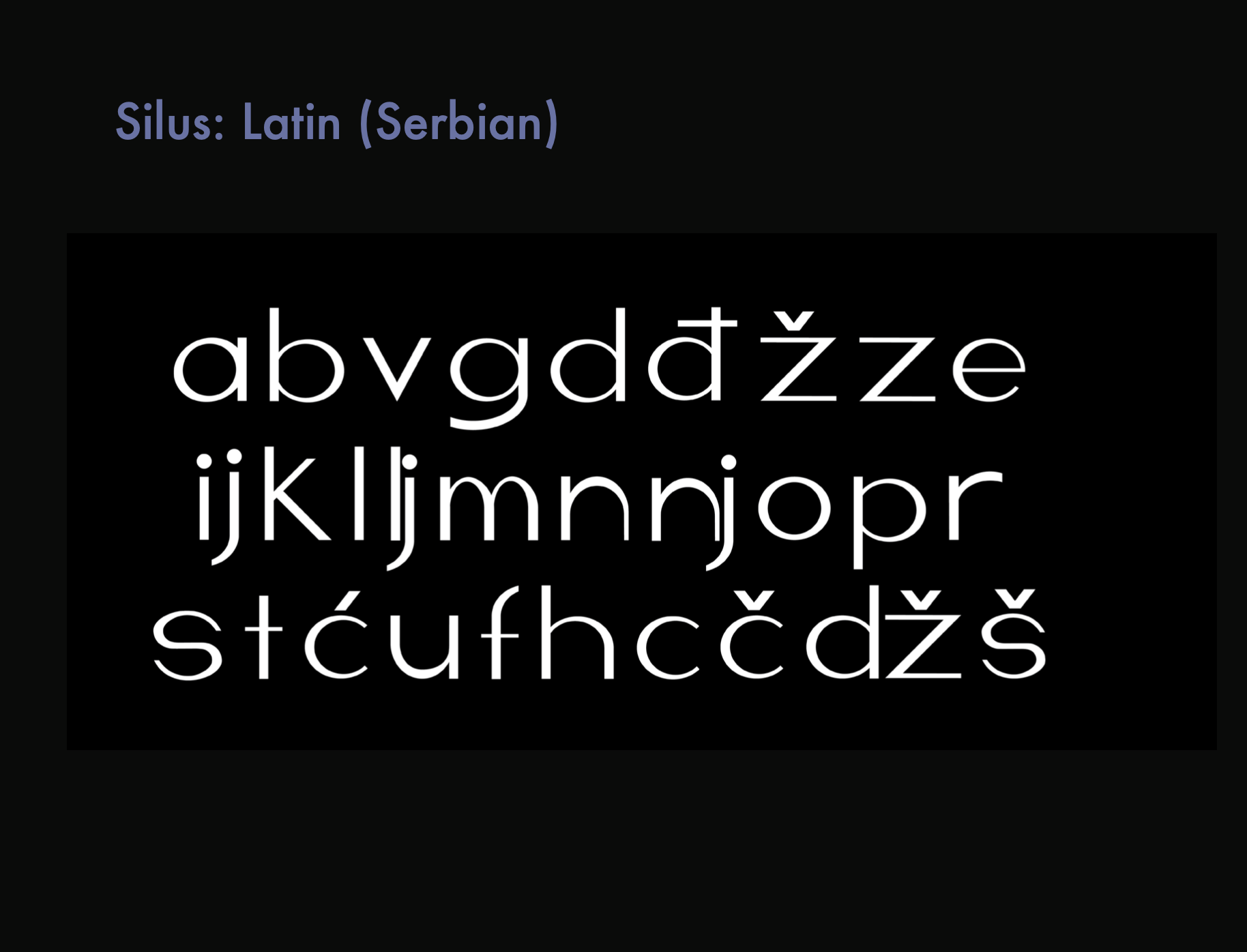
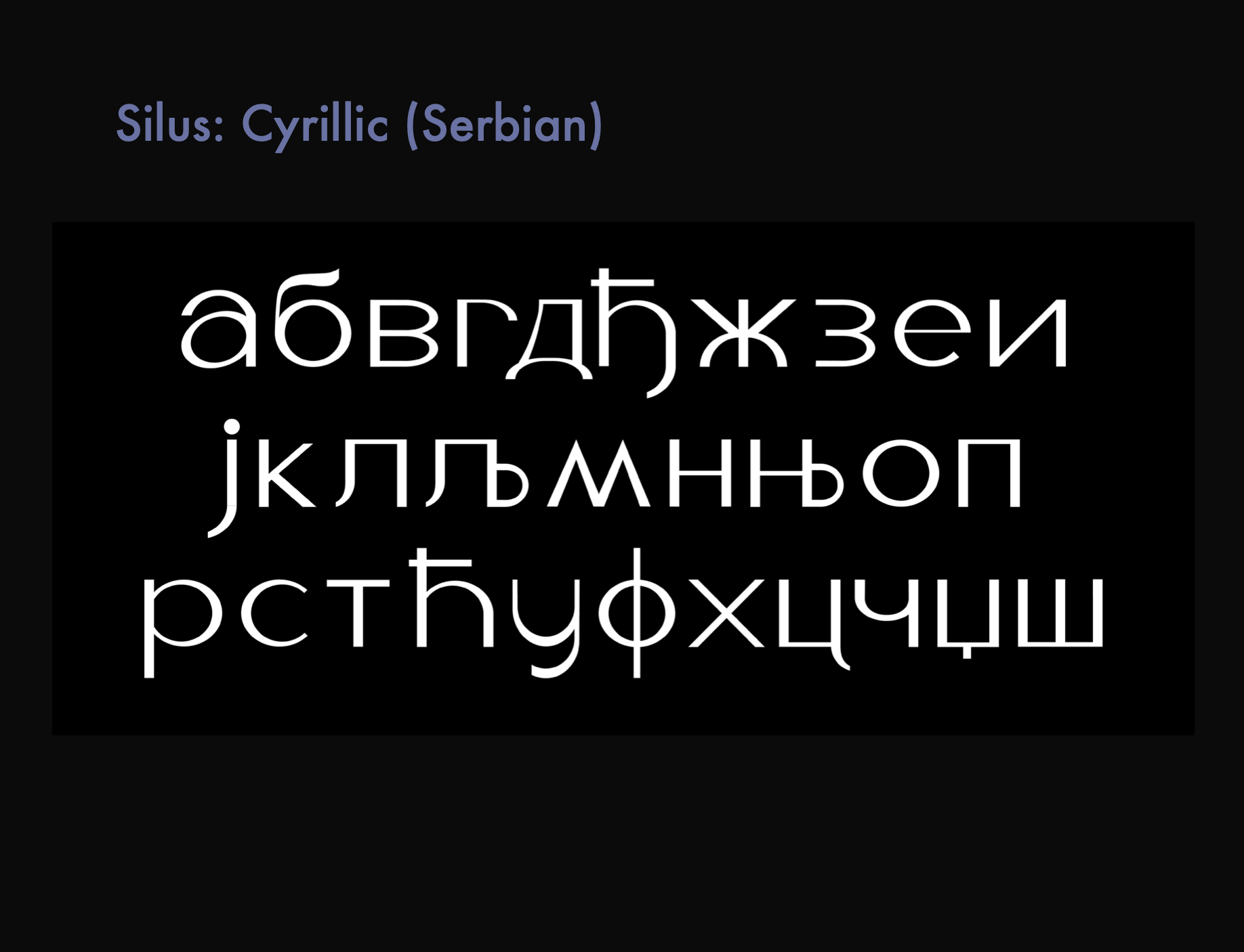
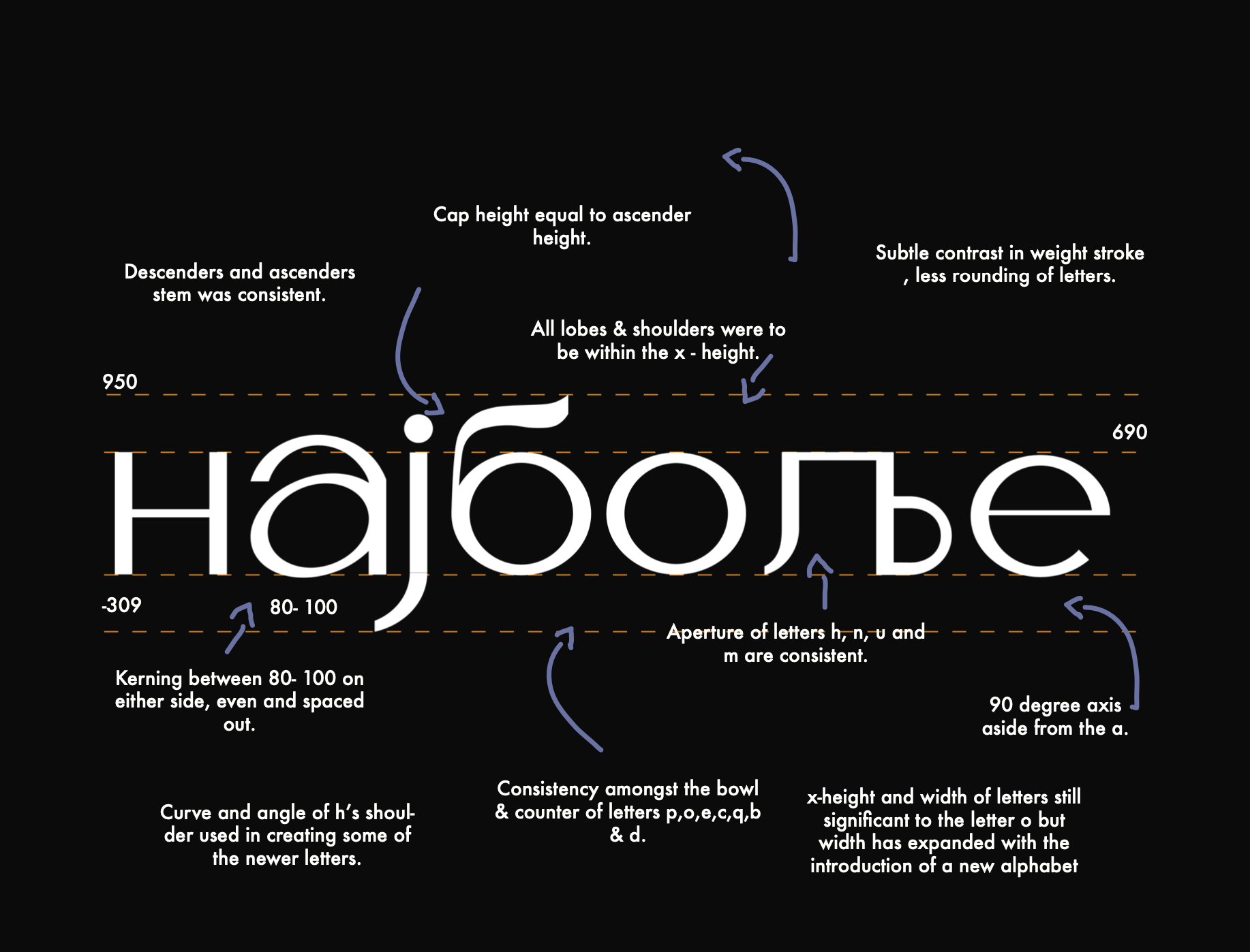
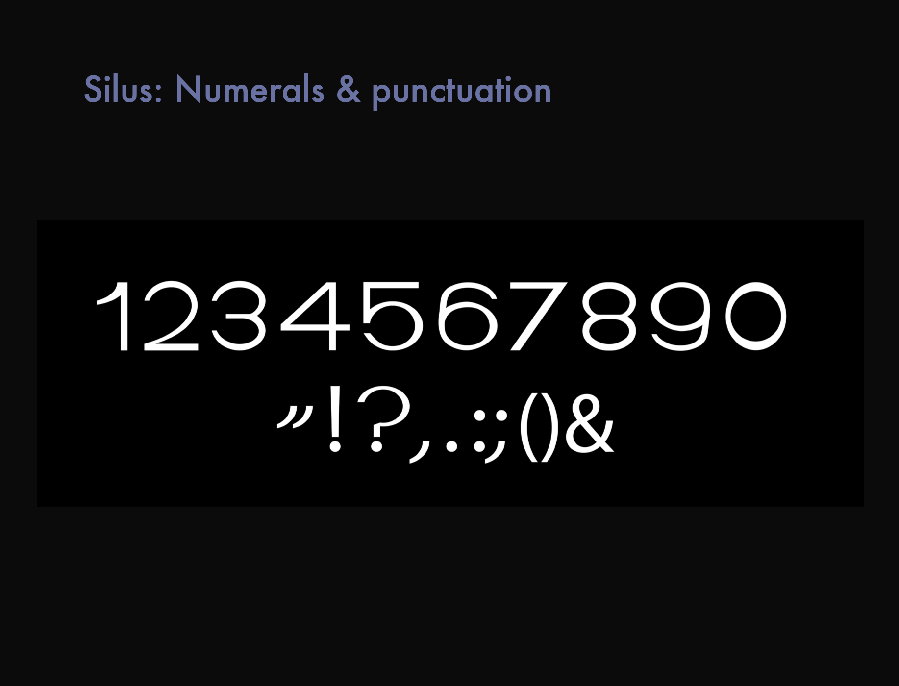
Inspired by the Acumin pro-wide family, I wanted to create a font that was distinguishable between two very different alphabets; Latin & Cyrillic script. I created Silus using no more than two different half circles to determine the overall aesthetic. I started off creating the basic letterforms such as a, i, c, & v as the foundation for the rest of the letters. My goal was to tweak as little as possible to convey the concept of resourcefulness and simplicity. Once the Latin alphabets in English and Serbian were established, developing the Cyrillic alphabet required additional half circles and more tweaks. I aimed to deter from the commonly seen heavy Cyrillic script and created a lighter, rounder font that conveyed the attributes of the Latin version.
